|
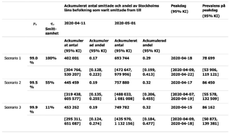
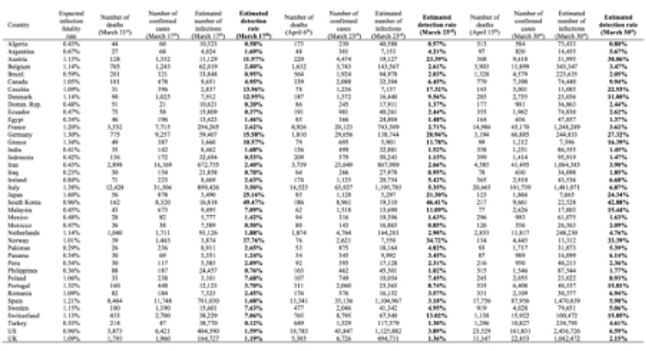
"There are known knowns. There are things we know we know. We also know there are known unknowns. That is to say, we know there are some things we do not know. But there are also unknown unknowns, the ones we don't know we don't know." (Secretary of Defense Donald Rumsfeld on February 12, 2002) Some knowns and unknowns of the Covid-19 pandemic Tables and graphs from Johns Hopkins Coronavirus Resource Center, Worldometers and the numerous national data dashboards present us with a flood of data apparently showing some knowns about the number of infections, the rate of growth or decline, number of mild cases, number people undergoing various forms of hospital treatment, the number of people who have recovered and the number who have died from Covid-19 infections Here just a snapshot from April 22, when a total 2,732,737 Covid-19 cases had been recorded (Worldometers) What we know is that we don’t know the real number of Covid-19 cases, but we may be fairly sure that the number is much bigger than the present 2,7 million cases. This also means that we surely don’t know with any degree of certainty the real mortality rate. We may, with some certainty, know the number of people who up until the present have died with a Covid-19 infection, even though we can’t even be sure of that. Did we count them all? In some countries only deaths in hospitals are counted, not those who died in a care home or at home. To see what this means one may take the example of England and Wales, where 9,288 deaths in hospitals had been reported up until April 18, while the overall number of deaths involving a Covid-19 infection in the same period stood at 13,121 deaths, meaning the total number of deaths were 41% higher that the number of hospital deaths. What then is the real mortality rate of the Covid-19? At the moment we may only have the crude case numbers based upon number of those tested to be infected and the number of deaths as counted up until now, but we don’t the real number of infected, nor do know how many of the infected will die later. Some time ago the New Scientist pointed to the problem: “In the UK, as of 2 April, 2921 people had died out of 33,718 confirmed cases – a crude case fatality rate of around 9%. For Italy, the figure is nearly 12% and for Germany just 1%.” Wildly different mortality rates telling us what? That we don’t really know the mortality rate for Covid-19 infections. If the percentage numbers for Italy and the UK were real, they would be truly horrifying. Assuming that 10% of the Italian population would become infected the crude death rate for Italy would indicate around 720,000 deaths out of a population of 60,36 million. The picture for Germany looks far rosier, but why? In order understand the possible explanations for such differences and get some kind idea of the real mortality rates, there has been various attempts to probe into the unknown using model calculations to get an idea of the total number of infected which might also give a more realistic idea of the real mortality rates. Probing the unknown – real mortality? On March 17 WHO indicated that the Covid-19 virus appeared to result in a higher mortality rate than influenza, apparently until then their frame of reference: “Mortality for COVID-19 appears higher than for influenza, especially seasonal influenza. While the true mortality of COVID-19 will take some time to fully understand, the data we have so far indicate that the crude mortality ratio (the number of reported deaths divided by the reported cases) is between 3-4%, the infection mortality rate (the number of reported deaths divided by the number of infections) will be lower. For seasonal influenza, mortality is usually well below 0.1%.” (WHO). That doesn’t help a lot, we need to have a better idea of the death rate. A scientific paper by Robert Verity et. al. attempt to provide robust estimates of fatality rates using available data mainly from China. (With a name like Verity we may have a case of nominative determinism, as verity means “belief or principle about life that is accepted as true). Verity and his colleagues found an overall case mortality ratio for China of 1.38%, but of course also far higher rates in the older age groups. With a rate 6,4% for those above 60 and 13,4% for those over 80. They also attempted to get an estimate of the real infection mortality rate using estimates of prevalence (i.e. the overall proportion of the population which has been infected) among international Wuhan residents repatriated, and found the overall infection fatality rate among those to be around 0.66% with a maximum for those over 80 years of 18.4%. An earlier paper by Anthony Hauser et.al. tried to estimate overall and age-related mortality rates for the early stages of the outbreak in the Hubei province in China and in Northern Italy. For Hubei they found “an adjusted mortality of 3.0% (95%CrI: 2.6-3.4) among all infected individuals,” but around 32% for those aged 80 or more. For Northern Italy they found an adjusted mortality rate of 3.3% (95%CrI: 2.0-4.7) among all people infected with SARS-CoV-2. For the group of symptomatic people aged 80 or more they estimated a mortality rate of around 89%. Another way of estimating the true number of deaths from corona infections may be to compare the total number of deaths for a similar period in previous years with the recorded total of death during the corona pandemic. Using measures of excess mortality This is what they have done in EUROMOMO (European Monitoring of excess mortality for public health action). Here a map showing the excess deaths in week 14 of 2020 measured in z-scores (standard deviations): Very high excess number of deaths is found in Italy, Switzerland, Spain, France, Belgium, The Netherlands, the UK, and Sweden, while a number of countries shown no measurable excess. Note most eastern European countries show no data. Recently The New York Times has tried a similar experiment. The assert that up until recently the number of deaths as a result of Covid-19 infections has been understated with at least 25.000 deaths. The calculated excess deaths for a number of regions and countries are shown in the table below (NYT) Probing the unknown – real number of infected? How many people in a given population are really infected with the Covid-19 at a certain point in time. Or in other words what is the prevalence? The small-scale attempt in Italy In Italy a small-scale experiment was carried out in the small town of Vo’ Euganeo in Northern Italy in late February. Professor Andrea Cristani and his team from the University of Padua carried out more than 3.300 tests on the whole population of the small town. 2,6% of the population tested positive, but importantly the majority of those “did not have any symptoms” according to Cristani. Meaning that they would not have been found when only testing people suspected of having been infected. The Austrian attempt to find the prevalence In what seems to be a world first countrywide attempt the Austrian government tried to find an answer to the same question by testing a sample of the population during a short period at the beginning of April. The project was led by the SORA Institute for Social Research and Consulting using normal procedures for sampling a population in collaboration with Medizinische Universität Wien, who was responsible for the actual testing. “The study population consists of all people living in Austria (excluding those currently in hospital). The youngest person in the sample was not yet one year old, the oldest 94 years.” (SORA). The actual sample contained 1,544 persons. The proportion of positively tested (normal PRC test) in the weighted sample was 0.33%, representing around 28,500 people of the Austrian population. The results from this study made it possible to calculate the actual prevalence in Austria at the beginning of April. With a confidence interval of 95 % it was found that between 0.12 and 0.76% of the population were infected, meaning that in addition to the number of people in hospitals the prevalence was between 10,200 and 67,400 people, at time of the testing. The wild excesses of the Swedish attempt At a press briefing in Stockholm on April 21 Anders Wallensten, Swedish deputy state epidemiologist, at Folkhälsomyndigheten (The Swedish Public Health Agency) presented a slide showing that according to calculations one third of the population in the Stockholm region would be infected with Covid-19 on May 1. Even more sensational, the slide asserted that for every case confirmed (bekräftat) there would be 1000 cases in all. Meaning only around 0.1 % all people infected had been identified and confirmed. Her a clip from the slide presentation on April 21 (Pressträff); Apparently it took some time for this sensational news to sink into brains of the journalists present. But later relevant questions were asked, as it would mean that the number of unidentified cases would be larger than the whole population of the Stockholm Region. The sensational assertions presented at the press briefing came from a study carried out to get an estimate of the actual prevalence of Covid-19 infected in the Stockholm region. The calculations showing the sensational numbers were based upon a small-scale empirical study of the prevalence of Covid-19 infected in the Stockholm region during the period March 26 to April 3 (Folkhälsomyndigheten). Apparently, a study quite similar to the Austrian study. Of the 1,106 selected in the sample 738 choose to participate and 707 of these gave useable test results. 18 people tested positive, while 689 tested negative at the time. Meaning that the sample showed a prevalence of 2,54%. Based on this result it was calculated that in the whole Stockholm region of 2,374,550 people around 59,000 would have been infected in the period (with a 95% confidence interval between 33,244 and 97,357) or between 1,4 and 4,2% of the population. The results of this study were then used in a so-called SEIR model, used in epidemiology to calculate the flow of people between four states: susceptible (S), exposed (E), infected (I), and resistant (R). Three basic scenarios were used in the calculations, as seen in the table below (First column showing guess on number of unidentified cases, second column showing guesses on infectiousness of unidentified cases). In reality the real rate of infectiousness apparently still eludes us. In scenario 3 the guess indicates that for 1case identified there will be 999 unidentified. These guesses and the different rates of infectiousness were used to make the model fit the empirical results of the small sample of the 707 people. As a result of guesses and SEIR model calculations the study estimates the total of number infected cases for April 11, May 1 and prevalence on the peak day (April 18). The estimates are found in the table below (Folkhälsomyndigheten). The authors of the study concluded: “Det scenario som ger bäst anpassning till antal rapporterade fall mellan 17 februari och 10 april 2020 är det där obekräftade fall är en tiondel så smittsamma som rapporterade fall. Detta scenario indikerar att det går 1 rapporterat fall per 1000 fall totalt, det vill säga 0.1 % av fallen rapporteras och 99.9% förblir obekräftade.” A fantastic projection! After questions were raised the model has been withdrawn ( New version see Folkhälsomyndigheten). A revised estimate was presented on April 23 together with the explanation that the previous model contained a faulty equation. The corrected model now estimates that 1 case for every 75 infected will have been identified. The corrected model estimates that the peak for infections was reached on April 8 and that 26 % of all people in the Stockholm region will have been infected by May 1. The reason for writing about this study in a little more detail is because it shows that attempts to probe the unknown by shining a small flickering light into the dark is fraught with strange guesses and assumptions, meaning that in reality we really don’t know the prevalence of Covid-19 in the population and the rates of infectiousness. The Covid-19 burden in France A working paper from the Institute Pasteur modelling the outbreak in France project that by May 11 “when interventions are scheduled to be eased, we project 3.7 million (range: 2.3-6.7) people, 5.7% of the population, will have been infected. Population immunity appears insufficient to avoid a second wave if all control measures are released at the end of the lockdown.” (medrxiv.org) A grand attempt to calculate prevalence “According to a recent analysis by two German researchers, the official numbers published by 40 national governments at the end of March represented just 6 percent of infections on average, meaning that "the true number of infected people worldwide may already have reached several tens of millions," as opposed to the current global tally of fewer than 2 million. (reason.com). The latest updated result of the model study carried out by Christian Bommer and Sebastian Vollmer at The University of Göttingen are found in the table below (reason.com) At least they find a detection rate for corona cases that is somewhat higher than the Swedes found in their strange scenarios. On March 30 the estimated detection rates for Covid-19 cases ranged from around 0.80% in Algeria to 42.88% in The Republic of Korea, presumably reflecting the strict testing and follow up regime in Korea.
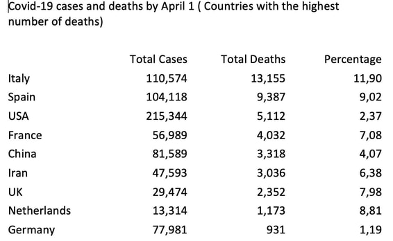
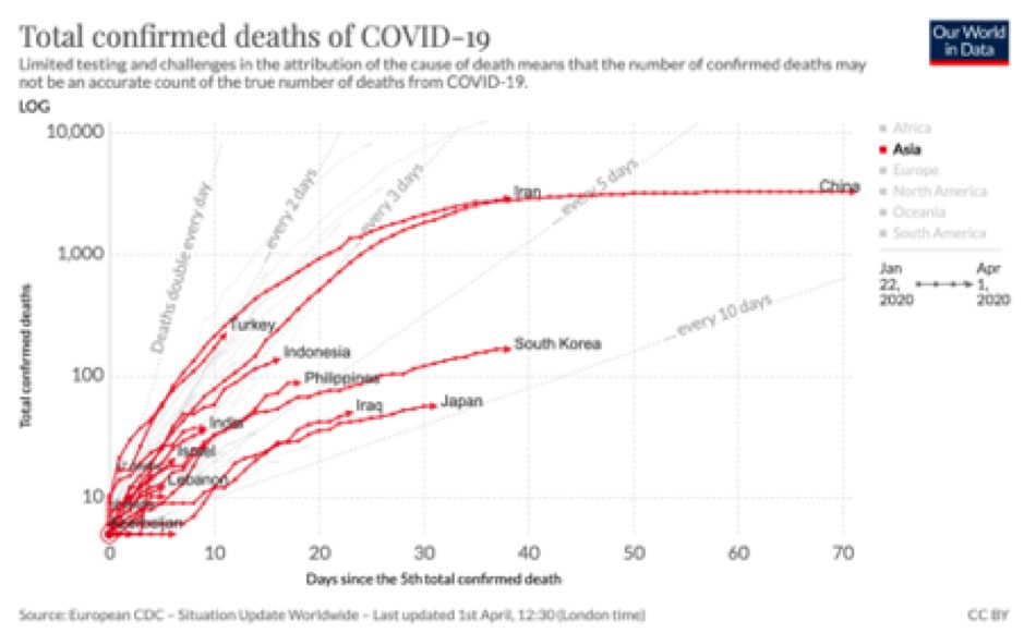
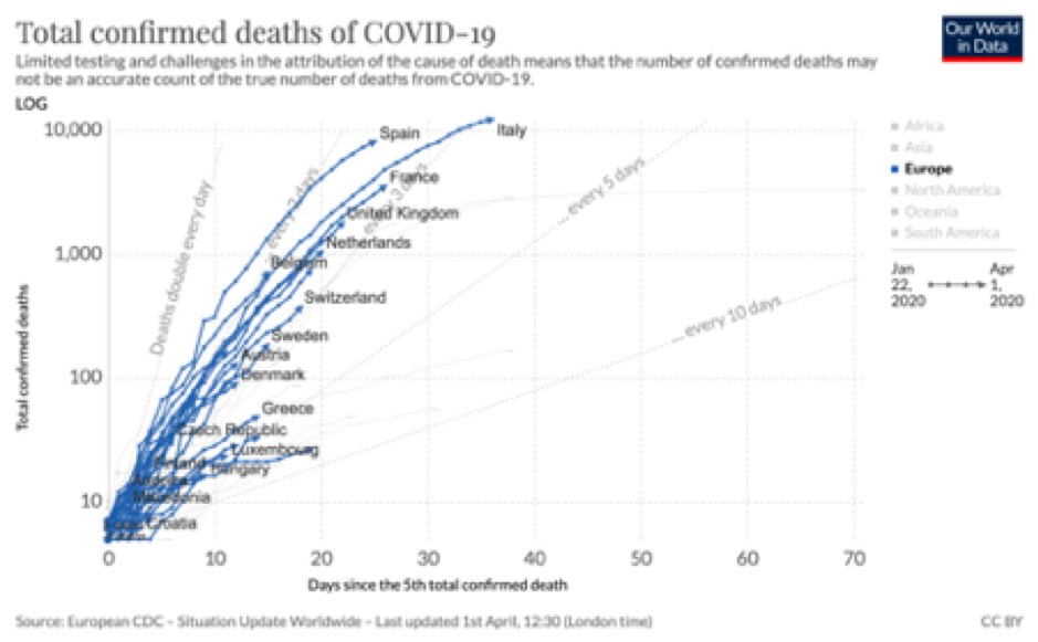
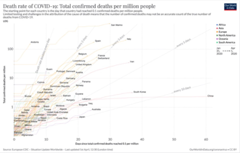
Now to the prevalence in numbers. For March 30 they calculated that the US alone already has 2,456,726 cases. The US thus having more cases than the whole World according to the WHO, Johns Hopkins, and Worldometer numbers for that date. The WHO situation reports for March 30 showed 693,282 cases for the World. Bommer and Vollmer’s estimates number of infections for some countries on March 30: Italy 1,481,071 Spain 1,470,639 France 1,248289 UK 1,042,472 Germany 244,833 Republic of South Korea 22,528 Denmark 25,056 And finally, Sweden 79,651 Taking a walk onto known thin ice, we might continue the estimations by setting some of those estimated numbers in relation to the actually recorded number of corona deaths up until April 10 (as an example of the delay in deaths) . Looking for instance at the Republic of South Korea, which recorded 208 deaths. Using the Bommer and Vollmer guestimates, that would result in a mortality rate of 1.09%. While Korea is far into the pandemic, Sweden at that point in time is in the early stages accordingly we might expect that such a simple calculation would underestimate the mortality rate, but anyway here you have it. Sweden recorded 870 deaths by April 10, giving us a mortality rate of just 0.92% in relation to the estimated 79,651 infected. For Denmark with 247 deaths by April 10 we would find 0.99%, but of cause that would be almost like using a crystal ball of models to get estimates of the real mortality rate. The need for more illuminating empirical data While much of the modelling has been based upon small-scale tests for infections (PRC swap tests) there is a need for serological tests (test for the presence of antibodies), to get more reliable data for real spread of Covid-19 infections in the population. “The second kind of test – serological tests – are generally still in the research stage of development. This kind of test will be central to establishing how far the Covid-19 has spread across the broader population. The Centre for Health Security at Johns Hopkins University provide up to date information on serology tests that are in development or available for use – whether for diagnosis, or only for research purposes.” (ourworldindata.org). Yesterday it was announced that UK would soon begin a major long-term study with aim of being able to track the spread of Covid-19 in the general population. The program will include antibody testing “to help understand levels of immunity.” Health Secretary Matt Hancock explained the purpose of the study: “Understanding more about the rate of COVID-19 infection in the general population, and the longer-term prevalence of antibodies, is a vital part of our ongoing response to this virus. This survey will help to track the current extent of transmission and infection in the UK, while also answering crucial questions about immunity as we continue to build up our understanding of this new virus. Together, these results will help us better understand the spread of the virus to date, predict the future trajectory and inform future action we take, including crucially the development of ground-breaking new tests and treatments.” In the initial phase up to 25,000 people will take part in repeated tests, but the intention is to extend up to around 300.000 people (presumably including both repeated swap tests to find number of infected at a given time and repeated blood tests to find number of people with antibodies and thus perhaps some form of immunity). Similar plans for testing a sample of the general population seem to be underway in other countries. In the US plans have been announced by CDC (Center for Disease Control). In Germany “According to the Robert Koch Institute, Germany's federal disease control and prevention agency, the first part of the study is to draw on the country's blood donation services, a second phase will focus on samples from regions with large Covid-19 outbreaks and a third stage will consist of a representative study of the country's broader population.” (NPR). Somewhat similar plans seem to be underway in Denmark. From crude interventions to precision interventions In order to substitute the crude but efficient instrument of a lock down, with more subtle instruments having a less damaging effects on people’s freedom and the economy, there is a need for more reliable empirical data obtained through such testing regimes. Until then it would seem that the only way to lift the lockdown is through staged trial and error, where the lockdown is first lifted in areas, where there is less risk of a major flare up. If all goes well after a wait and see period, the next trial and error experiment in lifting the lockdown can begin, and so forth and so on. This crude approach would seem to be the only tool available for a foreseeable future, at least until there are more reliable empirical data for prevalence, infectiousness, immunity, mortality rates etc., or until a suitable vaccine is available. Modelling based upon shadows? What have seen here may remind us of Plato’s cave metaphor. With today’s epidemiologists’ modellers and statisticians being only able to base their models on the shadows cast by the Covid-19 outbreak. The models and calculations we have seen here thus represent little more than guestimates based upon shadows cast by the outbreak, of some as yet unknown unknowns. The dismal prospects After comparing the total number of Covid-19 deaths in Asian countries with the total number of deaths in European countries one would really like to see an explanation for glaring differences between East and West, and the hesitant action in combatting the Corona virus at an early stage in the West. Only a few Western countries seem to have got their act together at an early stage, though of course the infections haven’t peaked yet. Covid-19 cases and Covid-19 deaths Countries with the highest number of Covid-19 cases and deaths by April 1. Note that some countries are still at an early stage. The simple percentage of course only takes into account reported cases, while total number of infected may be much higher, and it also ignores timing. This means that real deaths rates will probably turn out to be much lower overall, preliminary calculations indicate that the rate could be less than 1 percent overall. See also Financial Times “Coronavirus tracked: the latest figures as the pandemic spread” https://www.ft.com/coronavirus-latest Curves comparing East and West Total Covid-19 deaths (Asian Countries) (See animation at https://ourworldindata.org/coronavirus) ourworldindata.org Total Covid-19 deaths (European countries) (See animation at https://ourworldindata.org/coronavirus) ourworldindata.org Total Covid-19 deaths per million people April 1, 2020 (See animation at https://ourworldindata.org/grapher/covid-deaths-days-since-per-million) ourworldindata.org
Further material The misguided initial actions in the UK? The lack of real preparation and the misreading of developments seem evident in the minutes of the UK’s NERVTAG (New and Emerging Respiratory Virus Threats Advisory Group). Their minutes may be found at https://www.gov.uk/government/groups/new-and-emerging-respiratory-virus-threats-advisory-group Scientific advice relating to Covid-19 in the UK may also be found at Scientific Advisory Group for Emergencies (SAGE). The members of the group have turned out to be less sage than expected. They seem to have relied too much on evidence based upon earlier influenza pandemics. Perhaps forgetting that rigorous scientific evidence will often relate to something that has been, and problematic in relation to something new. See for instance their reference to the “SPI-M Modelling Summary, Prepared by the Scientific Pandemic Influenza Group on Modelling” https://www.gov.uk/government/groups/scientific-pandemic-influenza-subgroup-on-modelling “A public inquiry into the UK's coronavirus response would find a litany of failures” Anthony Costello in The Guardian, April 1. https://www.theguardian.com/commentisfree/2020/apr/01/public-inquiry-coronavirus-mass-testing-pandemic Chinese advice Not wearing masks to protect against coronavirus is a ‘big mistake,’ top Chinese scientist says, Interview in “Science”. https://www.sciencemag.org/news/2020/03/not-wearing-masks-p “Early Transmission Dynamics in Wuhan, China, of Novel Coronavirus–Infected Pneumonia” Qun Li et al. The New England Journal of Medicine https://www.nejm.org/doi/full/10.1056/NEJMoa2001316 On the Origin of SARS-CoV-2 “The proximal origin of SARS-CoV-2” Kristian G. Andersen et al. Nature Medicine https://www.nature.com/articles/s41591-020-0820-9 Simulation Simulating Covid-19 part 1 and 2 Blog entries by Paul Romer (economist and Nobel prize recipient). https://paulromer.net/covid-sim-part1/ https://paulromer.net/covid-sim-part2/ |
Author
Verner C. Petersen Archives
May 2024
|


